
Contents
- What photorealistic rendering means
- Light does most of the work
- Materials, and why roughness matters more than colour
- Imperfection is the whole trick
- Making the camera behave like a camera
- The tells that give a render away
- Render engines and software
- What it takes in time and money
- When photorealism is not the goal
- Frequently asked questions
Photorealistic rendering is the practice of producing a computer generated image that reads as a photograph. Not almost a photograph. A viewer scrolling past should have no reason to stop and wonder.
The interesting part is that photorealism is rarely lost on the big things. Geometry is usually fine. What gives a render away is small: an edge with no bevel, a surface that is uniformly clean, a shadow with the wrong softness. This page is about those details, because that is where the work actually is. We render products commercially, so what follows is what we correct in reviews rather than a list of software features.
What photorealistic rendering means
Worth clearing up first, because the word points at two different things. Photorealism with a capital P is an art movement from the late 1960s, painters working from photographs, the kind of thing hanging in the Tate. Photorealistic rendering is the 3D discipline: simulating how light physically behaves so the result is indistinguishable from a photo. If you landed here from the art side, that is the other subject.
How close does it get? A study out of Dartmouth College tested how well people can tell the difference. Untrained observers correctly identified real photographs 92 percent of the time but spotted computer generated images only 60 percent of the time. With a little training, accuracy on renders rose to 76 percent while accuracy on photographs slipped to 85. Two things follow: people are already poor at this, and the study is from 2016, so renderers have moved on considerably since it ran.
Light does most of the work
If a render looks wrong and you cannot say why, it is the lighting about eight times out of ten. Materials get the blame and rarely deserve it.
- Real light comes from surfaces, not points. A window is a large soft source, a bare bulb is a small hard one. Shadow edge softness is set by the size of the source relative to the object, and getting that relationship wrong reads as fake immediately.
- Global illumination. Light bounces and carries colour with it. A red box on a white table tints the table. Without bounce light, shadows go dead and the object looks pasted on.
- HDRI environments. A high dynamic range image of a real place lights the scene with real world variation, which is quicker and usually more convincing than building a rig from scratch.
- Reflections need something to reflect. Glossy products in an empty scene look like nothing on earth. Even off camera geometry that only exists to show up in a reflection earns its keep.
- Caustics. The bright patterns light makes through glass and liquid. Expensive to compute and instantly noticed when missing from a bottle or a glass.

Materials, and why roughness matters more than colour
Physically based rendering describes a surface by how it responds to light rather than by how it looks. Colour is the least interesting channel.
- Roughness is the one that sells it. How scattered the reflection is. And critically, roughness is never uniform on a real object. A phone back has smudge patterns, a kettle is duller where hands touch it. A single flat roughness value across a surface is the most common giveaway in amateur work.
- Fresnel. Every material gets more reflective at grazing angles. Look along a matte wall and it turns glossy. Modern engines do this automatically and it matters that you do not fight it.
- Subsurface scattering. Light entering a material, bouncing around inside and coming back out. Skin, wax, marble, milk, thin plastic. Without it these read as painted stone.
- Metals behave differently. They tint their own reflections and have no diffuse colour at all, which is why a metal set up as a grey plastic with high gloss never looks right.
- Scale your textures. A wood grain at the wrong physical size makes a cabinet look like a dollhouse. Texel density is not a technicality, it is realism.
Imperfection is the whole trick
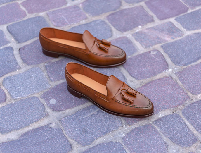
Nothing manufactured is perfect and nothing in use stays clean. A render that is flawless is a render that looks computed. The most reliable way to push an image over the line is to add controlled wear.
- Bevel every edge. There is no such thing as a perfectly sharp edge in the physical world. Even a razor catches light along its edge. A tiny bevel that produces a highlight line is possibly the highest value change per minute of work in this entire craft.
- Dust and fingerprints. Subtle, in the places a hand actually touches. Applied evenly it looks like a texture, applied where use happens it looks like life.
- Edge wear. Paint thins on corners, metal shows through, plastic polishes.
- Nothing perfectly straight or perfectly aligned. Cables have memory, labels sit a fraction off, fabric never falls symmetrically.
- Manufacturing marks. Seam lines, mould gates, weld spots. Buyers of industrial products know these should be there.
The discipline is restraint. Wear should be at the level you would notice only if you looked for it. Overdone grime is as artificial as none at all, just in the other direction.
Making the camera behave like a camera
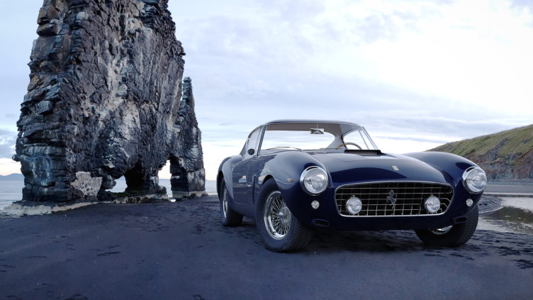
A virtual camera is perfect by default, and perfect is the problem. Photographs carry the fingerprints of physical optics, and viewers read those as proof.
- Use a plausible focal length. Product photography lives around 50 to 100mm. Wide angle lenses distort in ways that say render as loudly as anything else.
- Depth of field, gently. Real lenses cannot hold everything sharp. Heavy blur, though, is the classic beginner overcorrection.
- A trace of grain and chromatic aberration. Sensors are noisy and glass splits colour slightly at the edges of the frame.
- Tone mapping. Real cameras roll off highlights instead of clipping them. An unmapped render blows out whites in a way no photograph does. Colour pipelines such as ACES handle this properly.
- Shoot from a human height and angle. Impossible viewpoints break the illusion even when every surface is correct.
The tells that give a render away
The checklist we run before anything leaves the studio. If you are reviewing renders from a supplier, this is a useful thing to review against.
| What you see | What is actually wrong |
|---|---|
| The object looks pasted onto the background | No contact shadow, or the scene light and the object light do not match |
| Surfaces look like plastic whatever they are meant to be | One uniform roughness value with no variation |
| Edges look computer sharp | No bevel, so no highlight along the edge |
| The image feels flat and lifeless | Missing bounce light, or nothing in the environment to reflect |
| Whites look burnt out | No tone mapping on the highlights |
| Fabric or cable looks stiff | Simulated too rigidly, or not simulated at all |
| Everything is suspiciously clean | No dust, no wear, no fingerprints |
| The grain looks digital and even | Render noise left in rather than real grain added |
Render engines and software
All of the engines below can produce photoreal results. Choosing between them is about workflow and speed, not about which one is capable.
| Engine | Type | Usually chosen for |
|---|---|---|
| V-Ray | CPU and GPU | The industry workhorse for product and architecture |
| Corona | CPU | Interiors, forgiving defaults, easy to learn |
| Cycles in Blender | CPU and GPU | Free, capable, the common entry point |
| Arnold | CPU and GPU | Film and animation pipelines |
| Redshift and Octane | GPU | Speed, motion graphics, heavy iteration |
| KeyShot | CPU and GPU | Fast product visuals straight from CAD |
| Unreal Engine | Real time | Configurators and interactive work rather than stills |
The honest summary: an experienced artist gets a photoreal image out of free Blender, and a beginner gets an obviously fake one out of the most expensive licence on the market. The wider tool comparison is in our roundup of 3D modeling software, and if the modeling and rendering distinction is still fuzzy, this piece separates them.
What it takes in time and money
Two costs sit behind every photoreal image: the artist hours and the render hours. They trade against each other, which is why quotes vary so widely.
- Model. One to two days for something simple, one to two weeks for a complex assembly. This is the one time cost.
- Materials and lighting. Usually the day where the image is actually won or lost.
- Render time. Minutes per frame on a modern GPU for a product still, hours if there is glass, liquid or caustics. Render farms exist so deadlines survive this.
- Post production. Grading, grain, small composite fixes. Never skip it, it is often the last ten percent of realism.
Our published prices: a silo image on white from 1 dollar an image when a catalogue runs as a batch, an image with a scene around it from 120 dollars, a new colourway from 60, and a full set for one product from 360, delivered in 3 to 5 days. The stage by stage version of how a project runs is in the 10 stages of a rendering project, and how this compares against booking a photographer is in product photography cost.
When photorealism is not the goal
Chasing realism when the job does not need it wastes budget.
- Exploded views and technical illustration. Clarity beats realism. A clean flat style communicates assembly better than an accurate one.
- Stylised brand imagery. Some brands deliberately look rendered, and it reads as confidence rather than a shortcut.
- Concept and design review. A rough grey clay render answers form questions faster and lets people critique shape instead of lighting.
- Interactive 3D on a product page. Real time budgets cap what is possible, and a model that loads fast beats a beautiful one that does not. For the broader craft around photorealism, every shot type and every stage, see our 3D product rendering guide.
FAQ
If you have a product that needs images at this level, send the model or the CAD file, the materials list and a couple of references you like. We will tell you what is achievable and what it takes. The service details are on our product visualization services page.

Ian Diev
Content Writer, Editor
Ian loves writing about innovative 3D technologies and their impact on architecture and design. In his spare time, he makes indie music, watches obscure movies, and cooks culinary masterpieces for friends.