A PPRODUCT IMAGE THAT DRIVES CONVERSIONS: WHAT TO HIGHLIGHT
Product image is the key factor to success of an ecommerce business. It presents the merchandise and brand at the same time, gives information about the benefits of a model, shows different usages, inspires to take risks – in a word, it sells.
Which is why high-quality, informative imagery is a true marketing weapon that turns viewers into buyers. And conversely, bad product shots lose website visitors who could have become customers. Potential customers click on the expensive adwords advertisement, go to a magnificent website, look at 2 dull pictures of the item and leave. The most unnerving thing is that the product is a masterpiece: trendy elegant design, plenty of functions. What is wrong with these shoppers nowadays?
The key to the viewer’s heart is the product imagery. Catch his attention with it, give all information you possibly can, inspire and surprise – and you’ll get yourself a customer. As a product visualization company, we know how to create pictures that make viewers click the “buy” button. Let’s see how to get product shots that will convert your website visitors into clients.
#1. Show All Options Of Your Product
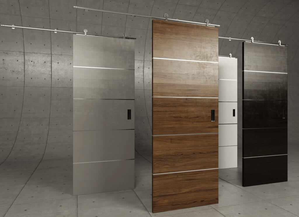
Shoppers want to have a choice – the more, the merrier. They enjoy the hunt, as well as imagining the benefits of each brand-new option. Which is why designers create a multitude of variations for each particular model. So that an armchair comes in pure white, pitch black, deep blue, bright yellow, soothing green, and there’s a wide choice of upholstery fabrics, like chic velvet, spectacular leather, sophisticated silk. And this variety is a unique selling point an ecommerce website should flaunt.
The two best ways to showcase product variations is through group and silo shots. The first type shows a whole selection together, while a silo image focuses on the benefits of one model only.
Sure, getting such product 3D images with photography is tedious journey. It involves sending a prototype of each product variation to the photographer, along with decor, and controlling the deadlines. But there’s a way easier alternative: 3D product modeling and rendering. Nowadays, skilled 3D Artists create photorealistic 3D models of any types of products, be it furniture, decor, cars or bottles of luxurious perfume. All they need to create a professional product image is a smartphone photo and dimensions.
#2. Showcase the Product From Different Angles
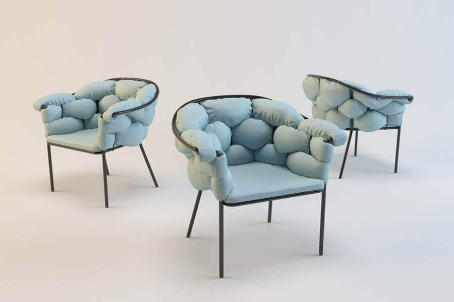
Can the general view image highlight the numerous benefits of your product design? So that the viewer thought: “Now I know exactly what the product looks like”. Certainly not. The shopper needs way more information than that, so he’ll go some place where he’ll find it. Like a brick-and-mortar shop, for instance.
To fill the gap, it’s necessary to show the merchandise from different angles. There is a variety of options for an ecommerce website to do just that: group shots offering different views of an item, 360° views, and even 3D animations. Choose the type that suits your design – and the happy viewer presses the Buy button.
#3. Use Close-up Product Image For Detailing
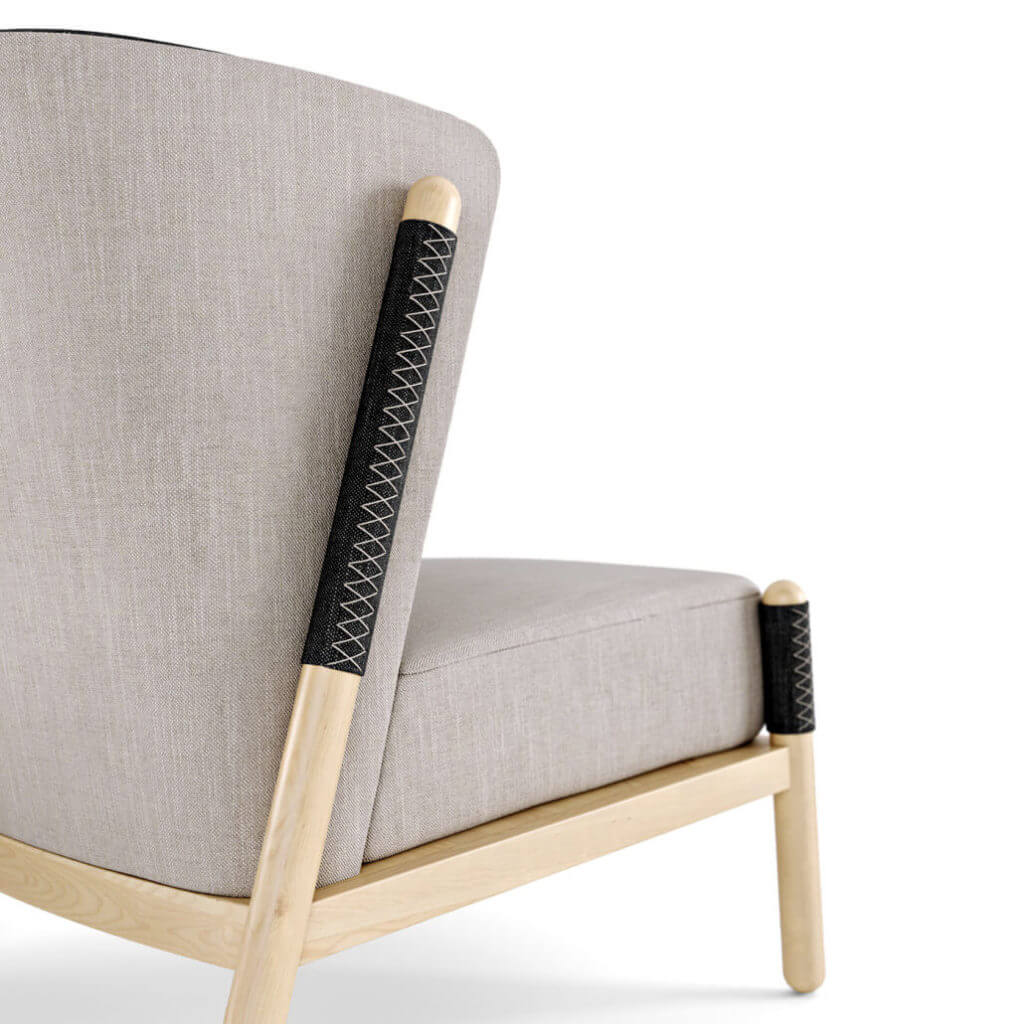
One of the reasons why many shoppers tend to choose physical stores over furniture e-commerce websites is the opportunity to closely examine the product. People need to feel the fabric, see the quality of each material, admire the richness of textures.
Of course, a virtual shop cannot arrange for the customer to physically experience the item on the website. But the e-store can get almost as close – by using the power of a close-up product image. Professional 3D rendering services allow to show materials with an astonishing realism, so that the viewer does not even realize he’s not looking at a photo.
#4. Emphasize Dimensions with a Scale Product Image
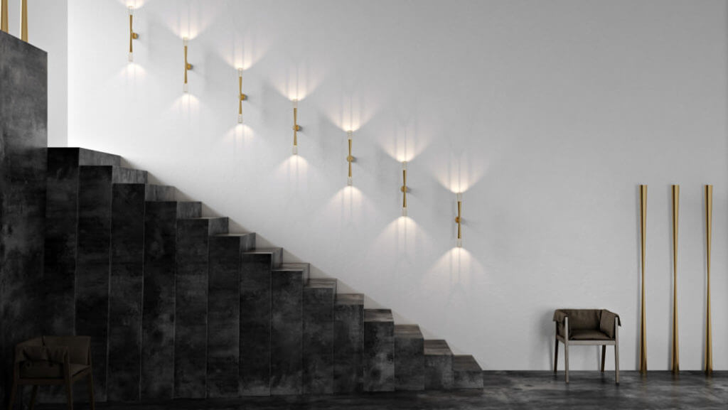
A scale shot is an image showing the product in a scene with other objects. The latter allow to imagine the size in real life and realise that this elegant chair will fit into the office. And finally, buy the item.
The thing is, a customer needs to know the exact proportions of a bed or chair to understand if it will fit into his or her bedroom. Of course, e-stores provide dimensions for each product. But what if not everyone can think in inches and meters? Especially when shopping away from home. Those figures need some illustrating, and a scale product image can do just that.
#5. Put the Product in the Context
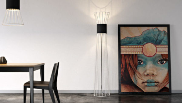
Context makes all the difference when it comes to making a merchandise stand out. Put in the different roomsets, the product reveals different sides of its visual appeal and proves to be a universal piece. And who’d pass on such a good investment? Moreover, the lifestyle product image will inspire customers. Roomset pictures give viewer new ideas about how to create a comfortable trendy environment at home, or how to make the product work in different settings.
And the best thing is that using 3D modeling and rendering, Manufacturers and Marketers can get product images with all of the advantages mentioned above, by simply finding a professional 3D Artist and providing him with a photo, dimensions and references for the environment. And then, these images can be used for digital and offline marketing campaigns, as well as for product catalogs. Need photorealistic visual content for your new collection? Contact UFO3D product rendering company. We’ll make sure each product image highlights your design with style and accuracy.
Let us know if you’ve got an interesting project and want to work together!


2 Comments on “PRODUCT IMAGE THAT CONVERTS: HOW TO GET PERFECT VISUALS FOR YOUR E-STORE”
Hi, I check your new stuff like every week. Your writing style is witty, keep it up!
Your stuff is great. Nicely written blog. Go ahead. Thanks.