Ecommerce Product Photography: How to Make Sure a Product Is Well Presented on Selling Platforms
Ecommerce product imagery is a tool that can help sell merch like hotcakes — but only if done right. Otherwise, even the goods that perfectly meet market needs might end up gathering dust in the storage. Which will be a disappointment for the manufacturer who invested much time and money in their development and production. So, why do images influence the commercial success of products so drastically? Let’s see.
The mission of ecommerce product photography is to attract buyers to an item and give them a comprehensive understanding of it. Online shoppers need to be able to see products from all sides, examine every detail and understand every function. Therefore, showcasing goods on photos or 3D renders in full splendor is essentially important. And for this, a marketer should know the basic rules of ecommerce product photography. With this knowledge, they will be always able to make sure that their items are presented in the best light possible.
So, how to showcase goods through photography or photorealistic product rendering in the most effective way? Read up to learn 6 keys to creating irresistible imagery for your products!
#1. Keep the focus on the product
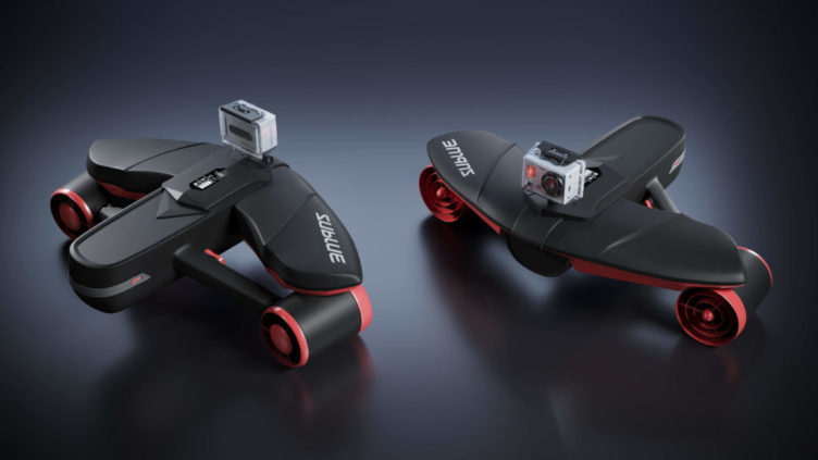
Ecommerce product photography has a clear purpose: to draw attention to an item, show it in full glory, and sell it. To achieve this goal, it is crucial to make sure that the merch is the hero of the shot. Too bright decor elements and fussy backgrounds can distract the viewer from the main object. Therefore, it is reasonable to choose a simple and neutral background for the products. It can be in pastel shades, in a bright but plain color, or simply white.
The effectiveness of this approach is proved by the fact that is it used by ecommerce giants. The requirements of one of the largest online selling platforms in the world, Amazon, state that brands must submit product pictures with white background. Marketers can obtain such imagery in several ways. They can have their products shot on white, or have them photographed on some other background and then remove it using special photo editing tools. Another convenient way is to order 3D renderings so that the whole process of creating images will happen on a computer.
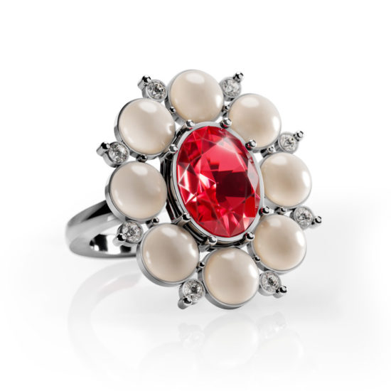
The ecommerce marketers should also remember that there should be not too many or too bright decor elements in the pics. Excessive props in the picture can divert shoppers’ attention from the item. It’s especially important for small products with numerous little details — like jewelry.
#2. Stay consistent
Inconsistent product pages with pictures of different sizes and styles confuse the potential buyers and spoil their shopping experience. This is why it’s so important to use one template with the same parameters for all the pics. This means that product photos should be of one size and format — landscape, square, or vertical. Which one to choose? It depends on a product’s shape. For example, the vertical format is a perfect choice for tall items, like fridges, or garment steamers. While the square shape of imagery will be the right decision for brands offering products of different sizes and forms.
Consistency in ecommerce product photography also means sticking to the same shooting angles, lighting, distances, and types of background. If all these parameters match, the website catalog looks harmonious. To keep pics alike with ease, it’s reasonable to create a photography guide. It is a list of settings that should be used for the brand’s product photo sessions. The guide must include information on preferable color schemes, distance from the product to the camera, the backdrop, saturation, contrast, type of props, and lighting settings. When all the parameters are noted down, it’s easy to apply them to the next photos or 3D product visualizations.
#3. Finetune the lighting
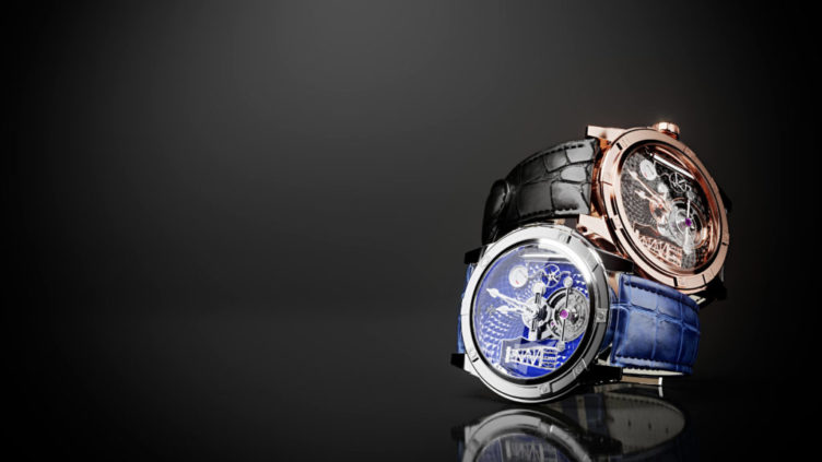
Lighting is a crucial aspect of ecommerce product photography. It can completely make or break an image. So, how to choose the perfect lighting for a brand’s imagery? Let’s see. First of all, light can be natural or artificial. Choosing one of these options highly depends on the type of product. If an item is meant to be used outside, it’s better to present it in natural lighting. But bringing this idea to life may be easier said than done. Natural light changes quickly and unpredictably, and no one can guarantee that the weather will be fine on the day of a planned photo session. To avoid the risk, a brand can order photoreal CG renders of its product. In this case, a professional 3D artist will set up lighting characteristics on a computer, and there’ll be no need to worry about weather changes.
Shadows in the picture are as important as light in ecommerce product photography. A sharp rough shadow doesn’t look aesthetic and negatively affects the way people perceive the picture. That is why professional photographers aim to create pics with soft shadows. There are different ways to achieve it. A photographer can use a fill light — an additional source positioned opposite to the main one. Another way to soften shadows is to use a flashbulb bounce card. It is a small card attached to a camera’s flash to diffuse it and create softer illumination. If a photographer does not utilize flashes, they can make use of standalone bounce cards. It may be a simple sheet of white paper placed opposed to the main light source. However, neither of these devices is needed if a brand opts for CG visualization instead of photography. Unlike a photographer, a 3D artist does not need any equipment except a computer with 3D software to create great product shots. So, this option is easier and faster compared to organizing a photo session.
#4. Provide enough visuals
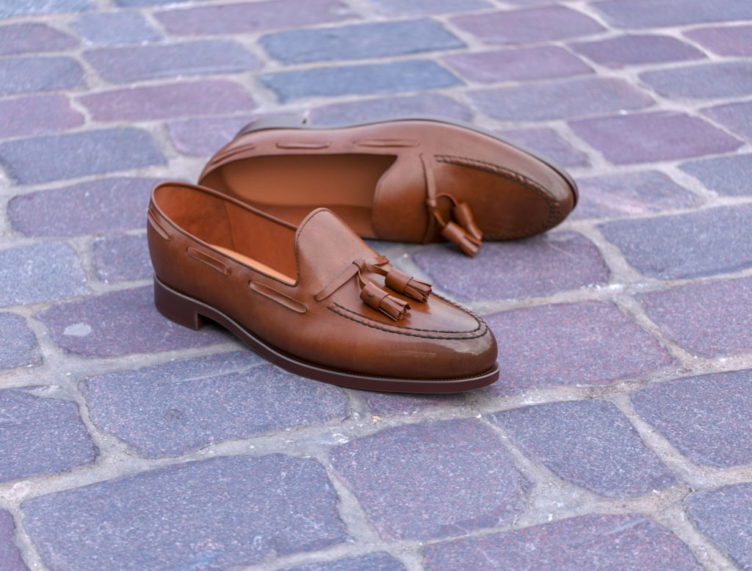
Ecommerce product photography cannot give buyers the same shopping experience as in brick-and-mortar stores. But it has to make this experience as close as possible to it. In brick-and-mortar showrooms, people can scrutinize merchandise from all angles. And they want to be able to do the same thing online. Therefore, to increase conversions, ecommerce businesses should showcase their products from different angles and distances.
It’s a great idea to show a product from each side — front, back, left, right, and also make two pics showing it at a 45-degree angle. It’s also reasonable to provide close-up views of details like engravings, surface texture, buttons, rivets, and so on. Also, it’s recommended to add at least one pic with a person showcasing a product in a lifestyle context. On top of that, a brand should provide a 360-degree view of an item. A 360-degree photo or CG render will let shoppers scrutinize an item from all sides with the help of only one interactive image.
#5. Use the right props
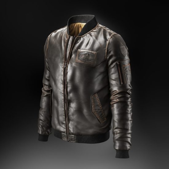
Some merchandise can’t be displayed properly without props. For example, visuals that present clothing without the help of mannequins or models cannot showcase the garment effectively. That is because they don’t allow viewers to visualize how the pieces will look when worn by on the body — which is exactly what online shoppers want to know. The purpose of ecommerce product photography is to help them do that easily.
Using a mannequin is a good option if an ecommerce marketer doesn’t want to spend extra money on hiring a model. To make photographs look fancy, one has to avoid using mannequins with no arms. They make sleeves look saggy, which distorts the perception of the piece. Also, it’s better not to avoid mannered poses that might look nice in physical showrooms but would appear weird in pictures after frame cropping and background removal. For example, if a mannequin displaying a t-shirt stands with its hand on its waist in a photo, it creates a visual imbalance.
Also, a brand can use the so-called “ghost mannequin”. It looks the same as it sounds: the apparel in pics looks like it is worn by an invisible person. This is a good way to create shots in which nothing distracts a viewer from the garment. And at the same time, the clothing will look natural. Such pictures can be made through both traditional product photography and photoreal 3D visualization.
#6. Use SEO optimization for imagery

Even if a manufacturer has done everything right in terms of ecommerce product photography, and the imagery looks perfect, it still might not work. It can happen if the marketer overlooks the importance of SEO optimization. The thing is that if pics are not SEO optimized, numerous problems might arise. Pictures might take too long to load, they don’t adjust to the size of the device, the page jumps when loading, and so on.
Therefore, it’s crucial to adjust illustrations to SEO requirements. Downsizing pictures will shorten load time and thus raise conversions. However, images must still be large and quality enough to represent the product in the best way. Another important thing to do with pictures is adding title and alt tags as well as captions. If website imagery is tagged with correct keywords and metadata, search engines will read them and increase website traffic.
As we can conclude from the information above, organizing a proper product photo session requires quite a lot of effort. However, getting quality visuals can be much easier. 3D rendering allows for creating any type of images with no organizational hassle. With CGI, there’s no need to transport products and mannequins to the studio and back, to set up the lighting equipment, and so on. 3D artists can visualize items on a computer with professional software. What is more, CG rendering allows for creating realistic images of products that are not even physically produced yet! All manufacturers need to do for this is to send drawings and visual references of a product to a CGI studio. This way, marketers can get top-notch product imagery for pre-selling their future goods.
If brands want ecommerce product photography to showcase merchandise in the best light, they need to follow a few simple rules. It is needed to avoid distracting fussy backgrounds and too many decor elements in the pics. It is also recommended to utilize useful props such as mannequins. Also, marketers should keep the imagery consistent, take care of proper lighting in the pictures, provide enough visuals, and remember about SEO optimization.
Want to make sure your ecommerce imagery showcases your products the best way online? Contact us for 3D modeling and rendering services and have your CG visuals made by a professional team of 3D artists!
Let us know if you’ve got an interesting project and want to work together!

